Bark and Bite: Lee Heinen’s Dog and Tree Paintings
By Roger Welchans, MFA, PhD
Cleveland Heights, Ohio
May 2006
In this “Bark and Bite” exhibition at her Alma Mater, Ursuline College, Cleveland artist Lee Heinen is showing two groups of recent paintings. One is a gathering of sizzling tree and vine pictures, and the other, a series of flamboyant portraits of indoor pet dogs.
Most of the paintings are executed in her current, highly personal, Realist style, a style she calls “over-the-top Realism,” using sweeping bravura brush strokes and raucous hues which clearly lean towards modern Expressionism. She is an artist whose “times” made her a Modernist as well as a Realist, and like other modern Realists, Fairfield Porter or David Hockney for example, she shares a kind of unspoken “brief” to intermingle abstraction with real appearances, a mixture which obviates naturalistic depiction but greatly increases the artist’s expressive possibilities.
When the above mixture is used skillfully, as it is in these paintings, it provokes thought and expands the meaning of the works beyond their merely decorative presence. Obviously, it’s also an assertion that the artist has something to say through the subjects she has chosen, and indeed these paintings do often prompt thoughts beyond plants and pets.
The Pet Dog Paintings
Pet dog portraiture as a genre is a province saturated with “whys” and “hows.” Why would a Modernist artist like Lee choose to practice this slightly anachronistic, mildly tarnished genre? How and why does she up-date it? What’s the message? To answer these queries requires a short note about earlier dog painting.
The earliest dog paintings appear in hunting scenes on the walls of Ice Age caves around 10,000 BCE. They depict “working dogs” as man’s loyal helpmates, a subject often repeated even to the present day.
But the type of pet-dog portraits revived here by Lee – the affectionate and humanized portrayal of individual indoor “family” dogs – evolved out of late 18th century aristocratic portraiture where they appear as cuddly canine ornaments nestled on the silken laps of elegant lace-cuffed, ivory-fingered sitters. As this type of painting became fashionable at court, it conferred upon these pretty creatures such enhanced social and family standing that they quickly emerged as the principal “sitters” themselves, to be displayed with the rest of the family portraits.
As an established genre, pet-dog portraits became an absolute rage during the Victorian period led by the Queen herself, who besotted with her extensive canine “family,” commissioned the leading Academicians to paint dozens of them – flawlessly dextrous, naturalistic portrayals of indolent, pampered “court” dogs, Pugs and English Bulls among them, all cutely be-ribboned and pertly posed amidst expensive baubles and bibelots – tasteful reminders of their owner’s station in life. Victoria’s pictorial passion quickly percolated down to the rising Middle Class, the “bourgeoisie,” who co-opted them as status symbols, and in accord with their taste, accelerated their inherent “cuteness factor” to a level of cloying sentimentality.
Of course, to 20th century Modernists such painting was anathema, reeking of bourgeois taste and plodding Academic technique. They saw no way in which it might advance their “brief” to develop a revolutionary new aesthetic appropriate to the brave new Machine Age. So they shunned it, but despite their censure, pet-dog portraiture never entirely vanished from popular culture. Even so, the most dedicated Modernist painters declared it “outre,” and if practiced publicly, a peril to their professional standing.
Why then would Lee decided to paint pet-dog portraits now? We can only speculate that it was prompted partially by her “artist’s cultural awareness” of our society’s ubiquitous coddling and humanization of dogs as “family members,” and partially by her personal, genuine affection for the pet dogs within her own family. Together they likely triggered a kind of “Victoria’s impulse” to commemorate them in portraits.
Whatever the exact reason, she did in fact decide to paint family dogs, “only the dogs she knows,” as she puts it, as commemorative gifts to her family and friends. At first, only four dogs were involved, two Pugs, an English Bull and a friend’s St. Bernard, so it might have seemed like a relatively short-term task. But instead, stimulated by a creative challenge to reinvent the genre, it evolved into a practically limitless “theme and variation” project.
The manner in which she deployed her Modernist “brief” against the old Victorian prototypes might best be described as an “attack,” one which obliterated almost every trace of its Academic and bourgeois “weaknesses”, and yet ingeniously retained a certain affection – but not a saccharine sentimentality – for the dogs themselves. We’ll discuss how she accomplished that later.
Her principal Modernist tactic, immediately evident when you scan the gallery, is to detonate a retinal blast of gaudy colors and fluid strokes crawling in loose networks over vividly contrasting ground colors which buzz through the interstices. Begone, Academic sobriety and drudgery! The resulting bumpy surface has a deliberately coarse “unfinished” quality, a kind of feigned ineptness and fictive spontaneity which masks the artist’s actual sustained engagement in the work. This too is part of the Modernist “brief”– make it look casually inventive, childishly simple, though of course it isn’t.
More importantly, all of her clotted paint smears, scratchings, swipes and puddles do in the end achieve their Modernist aesthetic goal, to remind us that these dogs are freshly and joyfully made of paint, not fur and flesh, and that consequently, the artist is free to explore thoughts and ideas beyond mere representation. This she emphatically does. Why else would these dogs be so provocatively “in-your-face,” so up-front and eager to burst through their picture planes?
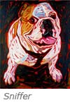
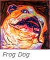 Why else are some of their faces pressed so close that they are cut off by the “frame,” like King Kong at the window. Why do some sniff at at us so aggressively with snouts foreshortened like reflections in a convex mirror (“Sniffer,” 2002), while others (“Frog Dog,” 2003) glare madly from faces which are half frog and half human as if plucked from Lavater’s peculiar 18th century charts on evolutionary physiognomy?
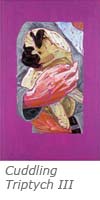 And what are we to think about the “sacred” English Bull, full length and spread-eagled, flashing its belly at us from a “cloth of honor” backdrop with a large, ragged patch of icon-like gold leaf? Does it ridicule its status within the family, or perhaps the family itself? Then there’s the vignette triptych of the the thrice coddled Pug in the arms of a remarkably ham-handed, headless “sitter”wearing a sweatshirt – surely a burlesque of its 18th century aristocratic prototype That hand especially, flayed of its predecessor’s ivory shell – is a worthy bit of Modernist expressive Realism.
The fact is, that the artist presents many of these dogs – not all of them, as caricatures, the artful exaggerations of which always cut two ways, eliciting both affectionate humor and “biting” satire. About the latter, it’s fair to ask what or who is being lampooned? The dogs? The owners? The Victorian prototypes? Bourgeois taste? The leisure class? The pet industry? Conspicuous consumption? Well, probably all of the above, and perhaps more.
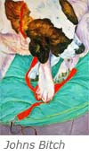
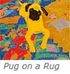 Those dogs which are not caricatures – like the giantized St. Bernard (“John’s Bitch,” 2006 ) or the flat, yellow “Pug on a rug,” 2006 – are attractive Realist studies in decorative form, an aesthetic “bark” without the satirical “bite.” I think we must conclude that Lee has managed cleverly to sidestep bourgeois “cuteness,” and replace its annoying sentimentality either with warm humor or pleasurable aesthetic design, not to mention a surprisingly gritty iconography. Surely, even the hardest-core Modernist is thus free to admire her brand of pet-dog paintings.
The Tree Paintings
About trees, humanity has forever endowed them with special human traits and roles, good and bad. Lee finds in them the beneficent qualities of sage and patient elders, “living witnesses of time,” as she puts it. She’s fascinated too by their tolerant longevity, their increasing majesty and “character” as they age, and very real function in life as guardians, protectors, and replenishers of oxygen.
As a Realist artist, not a Romantic or a Surrealist, she paints recognizable trees, but modified by her Modernist “brief” which precludes fussing with such epidermal details as bark (ironically, given the title of the show) because it could detract from her freedom to convey “something” beyond surface appearances. There are indications in this show that the “something”is nothing less than the universal “life force” shared by trees and us. In some respects that’s the ultimate humanization of trees.
Mystical though it may sound, it isn’t, Lee’s trees are not the spiritualized, other worldly “God-made” trees of George Inness, nor are they kin to the pretty, “cotton-candy” woods of Wolf Kahn and his circle. Instead, they are visceral, carnal residents of the material world; direct, bold and un-labored visual signs of the sinuous and fluid “matter” of life assertively translated into paint.
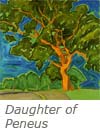
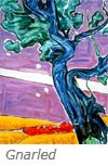 Her most elementary humanization of a tree, probably accidental, is found in “Daughter of Peneus,” (1999) where the title is an oblique reference Daphne, whose torso and arms are discernable in the trunk and boughs, transformed into a tree by her father, a river god, to save her from the unwanted advances of Apollo. Other works, like “Gnarled,” (1999) might simply invite empathetic responses to their apparent muscular exertions, but they were primarily intended as “character” studies, which become more engaging as the artist expands her expressive vocabulary.
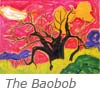
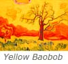 Often, such expansion requires a visual jolt. For Matisse, it was a trip to Morocco. For Lee, a trip to Africa, where her experience with the intense heat, light, and aridity changed her palette to the hottest, most vivid color combinations of her career, which she applied specifically to her “character” studies of African trees. The two Baobab paintings in the show (The Baobab, and Yellow Baobab, both from 1999) are early products of the African adventure, and indeed, the thorn-like trees virtually crackle in a parching, firey red-yellow atmosphere. But several years later another “hot” painting, “Red Trees,” (2003) reflects a more sophisticated use of incandescent light, implied humidity, and simmering heat.
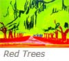 The upper two-thirds of “Red Trees” is occupied by a thin mass of feverish yellow-green “foliage,” bleached out as if overexposed in a flash of hot light. A few dripping dark lines add a note of moisture and look like limp, dangling Spanish moss without really trying too hard. Some thin yellow lines wander crookedly in a small area of the hot green looking for something to describe, but give up. The whole steamy mass hovers over an alley of flat red trunks rising like cooking flames from a molten red-orange earth to be silhouetted against a strip of torrid yellow sky.
The heat looks oppressive. And the “pulse” of the painting – that is, the degree of energy apparent in its execution – is intelligently minimal, reinforcing a sense of enervation.
Because of the clarity of her execution, almost all of Lee’s paintings have a “pulse,” ranging from languid to twitching to frenetic, and “reading” it often provides the key to her expressive intention.
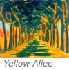 Check the “pulse” of a similar painting, “Yellow Alee,” (2001). It’s rapid compared to “Red Trees,” and very readable in the short, swift strokes which rustle and cool the leafy canopy providing respite from the hot light beyond. The “livin’ is easy” here. We should notice also that the trees in this picture are painted in “X-ray” mode, showing us the inside red core of the green trunks and branches. While these red streaks provide a structural “spine” for the mass of green foliage, they are likewise clear evidence of her interest in making visible their invisible interior.
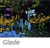
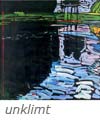 Two years later, in 2004, for an experimental “jolt,” Lee tried her “steroid” hues on black canvases (“Glade,” and “unklimt,” both from 2004). Her usual execution separates most strokes from each other and permits a vivid ground color to unify and excite them, but the black under painting prevents that, forcing each hue separately to sing its own song with clear and penetrating intensity. The colors glow as if exposed to ultra violet illumination, and each stroke acquires an extraordinary calligraphic presence.
While the effect is aesthetically pungent, it is also eerie, like stripping nature’s epidermis to expose its inner circulatory or neural systems. Again we see her getting closer to nature’s “insides,” perhaps nudging her towards the challenge of painting a universal “life force,” so elusive for western artists, but intentionally present in every thoughtful stroke rendered by the Chinese masters.
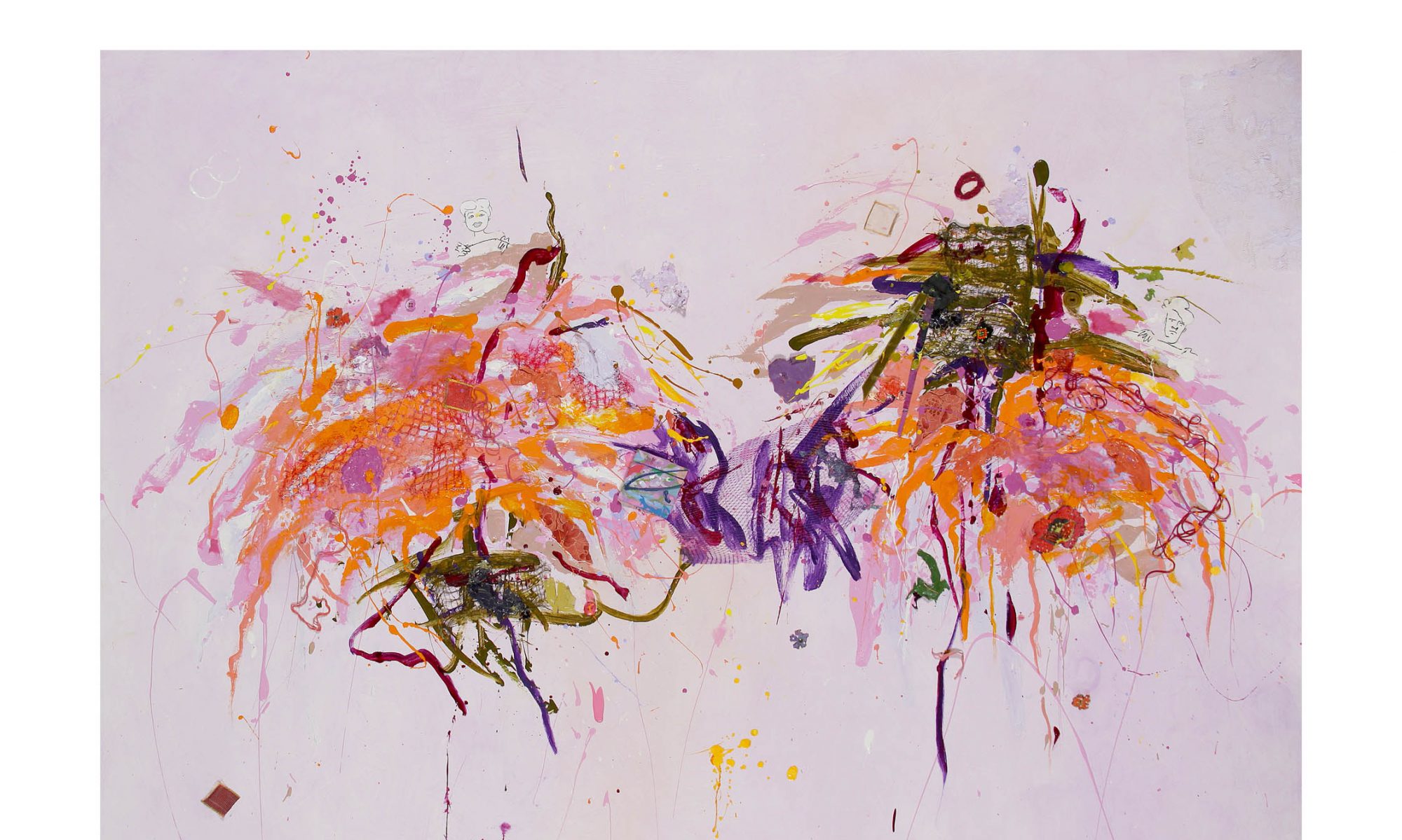
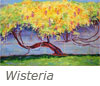 Whatever the stimulus, perhaps her experiences in China, she made a significant breakthrough towards that end in “Wisteria,” (2006) a risky, “over-the-top” Realist tour de force with an agitated, even fibrillating “pulse” rate in which some powerful force within this sprawling tree has propelled new growth and delicate blossoms explosively through nature’s constraining husks, the new life unfolding in triumph among the debris of renewal.
There is something Oriental about the splintery calligraphy of the action, achieved with a paint-soaked feather duster slapped, dribbled and whisked with controlled abandon, and also about the meditative focus on an unseen force below the surface.
The 17th century critic Roger de Piles argued that a good picture ought to be able to stop a spectator in his tracks. “Wisteria” qualifies, and it’s highly likely that its sequel, a five canvas “Wisteria Cycle” – unfinished at this writing – which refines and intensifies the discoveries of the breakthrough, will have a proportionally greater aesthetic impact. Together, they tend to confirm that Lee is sufficiently impious and adventurous to take the risks required for new discoveries. We await them.